Creating a React Component Library with TypeScript, Storybook & Rollup


A shared UI component library is fundamental to the frontend architecture of a growing company where you have teams maintaining several projects that use the same visual elements. The UI component library ensures visual consistency between projects owned by different teams and improves productivity since you can update components, fix visual issues, and solve similar problems in a single place.
If you have a single project, you don't need a separate library for your components as you can define them directly in your project.
This post shows how to set up and get started using
- Create React App for installing React and Testing Library
- Storybook for documenting and showcasing components in isolation
- Rollup for bundling the library
You can find the resulting project on GitHub.
Create React App
To get started, we can create a new project called ui using Create React App:
npx create-react-app ui --template typescript
This generates boilerplate code that allows us to create React components and test them using React Testing Library.
You can remove start, build and eject scripts from package.json because we will use Storybook to start our project and Rollup to bundle a production-ready package.
"scripts": {
  "test": "react-scripts test"
},
You can also remove App.tsx, App.css, App.test.tsx, index.css, index.tsx, logo.svg, reportWebVitals.ts since we won't use them.
Setting up Storybook
Storybook is a wonderful tool for developing, showcasing and documenting UI components in isolation. Storybook works with any component-based library in JavaScript such as React, Vue, Angular, and more.
To install Storybook in our React application, run this command:
npx sb init
You should now be able to run Storybook locally by running npm run storybook or if you prefer yarn storybook.
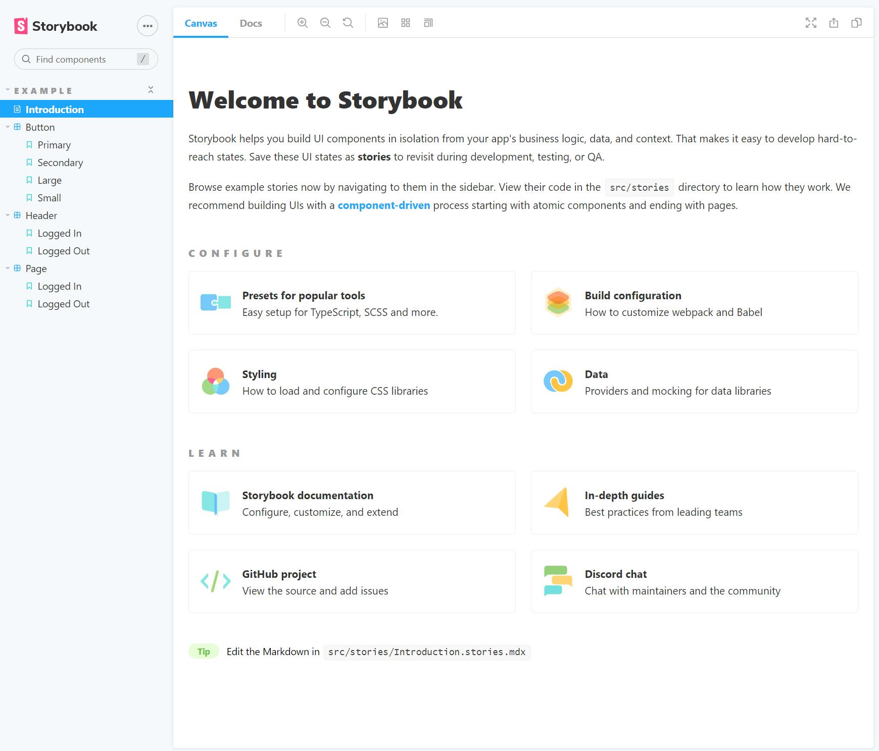
Here is a preview of the Storybook application:
Understanding the Project Structure with Storybook
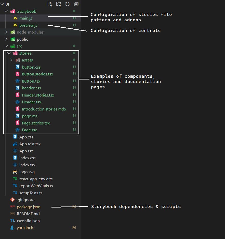
The stories folder
By default, the npx sb init command creates a stories folder inside src with example components and documentation pages. While you can safely remove this folder, I recommend exploring it first!
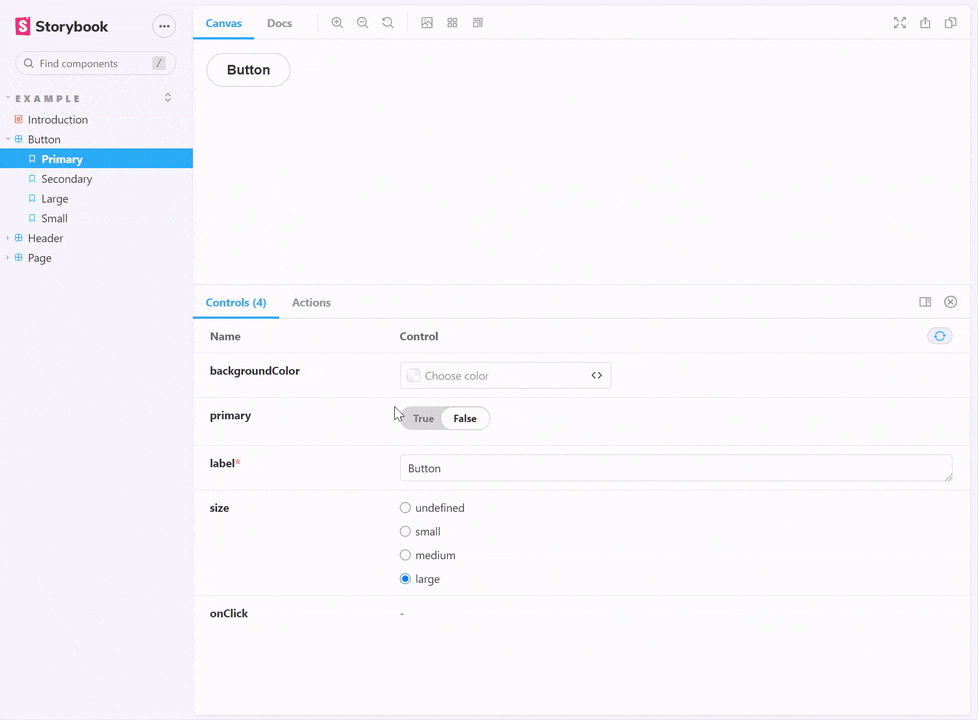
Introduction.stories.mdxfile contains the documentation used to generate the Introduction to Storybook page in the image preview above. The file is written using MDX format, which is a combination of Markdown and JSX, so you can write components directly into the documentation. The links in this file are also worth exploring!Button.tsxandButton.stories.tsxare great examples of how you can define a component and a corresponding page in Storybook. The Button story documents available props, code usage, and showcases component variations. Through the Controls, you can experiment with toggling and customizing props.
The .storybook folder
Contains files for customizing Storybook:
main.jsdefines the file pattern used by Storybook to determine what to include in the showcase application. By default, Storybook uses files containing.storiesin their name."stories": [ "../src/**/*.stories.mdx", "../src/**/*.stories.@(js|jsx|ts|tsx)" ]main.js."addons": [ "@storybook/addon-links", "@storybook/addon-essentials", "@storybook/preset-create-react-app" ]preview.jsconfigures how actions and controls will show up depending on the prop's name. By default, props starting withonsuch asonClick,onChange,onSubmitare automatically interpreted by Storybook as actions, so when triggered, they get logged inside Storybook's Actions addon. Besides, props suffixed withbackgroundandcolorwill show a color picker control, whereas props suffixed withDatedisplay a date picker control.export const parameters = { actions: { argTypesRegex: "^on[A-Z].*" }, controls: { matchers: { color: /(background|color)$/i, date: /Date$/, }, }, }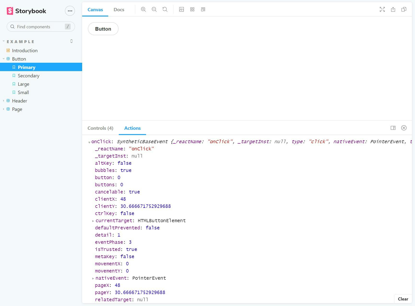
The package.json file
This file is automatically updated with Storybook development dependencies, custom eslint configuration for stories, and the following scripts:
  "scripts": {
    "test": "react-scripts test",
    "storybook": "start-storybook -p 6006 -s public",
    "build-storybook": "build-storybook -s public"
  },
npm run storybookstarts the Storybook application locallynpm run build-storybookbuilds the Storybook application ready for deployment
Rollup needs an entry point to generate the bundle. Let's create index.ts in the src file that exports each of our components generated by Storybook:
export * from "./stories/Button"
export * from "./stories/Header"
export * from "./stories/Page"
Bundling with Rollup
Rollup is a good bundling tool choice if we want to package the React component library and reuse it in other projects.
In Webpack and Rollup: the same but different Rich Harris recommends using Webpack for applications and Rollup for libraries.
First, you need to install dependencies either using npm
npm install @rollup/plugin-commonjs @rollup/plugin-node-resolve rollup-plugin-peer-deps-external @rollup/plugin-typescript postcss rollup-plugin-postcss --save-dev
or with yarn
yarn add rollup @rollup/plugin-commonjs @rollup/plugin-node-resolve rollup-plugin-peer-deps-external @rollup/plugin-typescript postcss rollup-plugin-postcss -D
Let's understand these dependencies:
rollupgives the command-line interface (CLI) to bundle the library@rollup/plugin-commonjsconverts CommonJS modules (potentially used in node_modules) to ES6, which is what Rollup understands. If you don't know what CommonJS modules are, this article explains module systems in JavaScript: What the heck are CJS AMD UMD and ESM in JavaScript?@rollup/plugin-node-resolvehelps Rollup understand how to import dependencies innode_modules.@rollup/plugin-typescripttranspiles TypeScript files to JavaScript.rollup-plugin-peer-deps-externalprevents adding peer dependencies to the bundle because the consumer of the library is expected to have them. So we also get a smaller bundle size.rollup-plugin-postcssintegrates with PostCss tool for bundling styles. You can configure this tool with CSS modules, Less, Sass, depending on your preference.
Next, we need to update package.json.
According to the Rollup Wiki, libraries should be distributed using CommonJS and ES6. We specify the output file paths using main and module properties. We also use these properties in the Rollup configuration file.
Then, add a build script that uses the rollup command-line interface with the -c argument. This means that Rollup will look for a configuration file named rollup.config.js to bundle the component library.
Add react and react-dom to peerDependencies and devDependencies (we still need them for Storybook) and remove these from dependencies. This is needed by rollup-plugin-peer-deps-external plugin to prevent distributing and bundling dependencies that the consumer library already has.
{
  ...
  "main": "./build/index.js",
  "module": "./build/index.es.js",
  "scripts": {
    ...
    "build": "rollup -c"
  },
  "peerDependencies": {
    "react": "^17.0.2",
    "react-dom": "^17.0.2"
  },
  "devDependencies": {
    ...
    "react": "^17.0.2",
    "react-dom": "^17.0.2"
  }
}
Finally, the rollup.config.js file has the following contents:
import commonjs from "@rollup/plugin-commonjs";
import resolve from "@rollup/plugin-node-resolve";
import peerDepsExternal from "rollup-plugin-peer-deps-external";
import typescript from "@rollup/plugin-typescript";
import postcss from "rollup-plugin-postcss";

import packageJson from "./package.json";

// eslint-disable-next-line import/no-anonymous-default-export
export default {
  input: "./src/index.ts",
  output: [
    {
      file: packageJson.main,
      format: "cjs",
      sourcemap: true
    },
    {
      file: packageJson.module,
      format: "esm",
      sourcemap: true
    }
  ],
  plugins: [
    peerDepsExternal(),
    resolve(),
    commonjs(),
    typescript(),
    postcss()
  ]
};
Conclusion
We created a React component library powered by Create React App. We installed Storybook to create a documentation page and enable developing components in isolation. Finally, we configured Rollup for bundled the library.
While this is one way of getting started, an alternative approach could be based on Create React Library. Let me know if you would like to see an article about that.
I hope you found this interesting. Thanks for reading!